Whoa have not been posting on this for a while. Busy with my Microsoft internship, finished last Friday and got a return offer :) maybe I'll talk about my experience this summer another time but for now.. I'm at SIGGRAPH and want to document my experiences so I don't forget.
The first two talks I probably shouldn't have gone to, they seemed to be for absolute beginners in graphics and I'm pleased to notice I actually knew most of what they were talking about.
The last two talks I went to were both hosted by Pixar speakers and did not disappoint.
[TALKS] Inside Your Head and Out of This World
I have not seen Inside Out and I have been wanting to. This talk covered a few aspects of this film.
An Abstract Journey
Talked about how people from different teams came together to make the abstract sequence in "Inside Out" work. Usually Pixar has a pretty linear workflow that they have used in success for their past movies, but this sequence required teams to depend on each other to make progress. The first speaker talked about how he came up with the art for the sequence, where he was told not to base it on a certain type of art but he kind of did anyway. Talked about how he researched a lot of different types of abstract art and ultimately came up with the three abstract progressions of the characters: the blocky cubism, the 2D John Miro style, and the basic shapes that represented the essence of the characters. (I've never seen this sequence before today but I really, really loved the artistic direction that was taken). I thought it was so amazing how one guy was responsible for the really creative output that determined the direction of the sequence. Then the shaded lady took over, who took textures from the original characters and applied them to the block shape. She noticed the textures looked flat and unappealing, so she took Sadness's hair as an example of how she added dimension by taking a honeycomb pattern, warped it, did something else with it, and added a clear coat. Then the animation guy talked about how animation was done. Each progression had different types of animation, for example the 2D characters had a more limited range of animation than the 3D blocky characters. Even when they got to the line shape it was amazing how much personality they were still able to put. There was one more guy I forget, I wish I would've taken better notes.
The Ins and Outs of Camera Structure on "Inside Out"
This talk was the camera guy. The two worlds, inside the mind and outside the mind, had different styles of cameras used. For example, the outside world's camera had more of a lens distortion (this movie was the first time Pixar modeled its cameras on real life lenses), had more of a hand held style of camera animation (as opposed to the inside world, where a more mechanical style of camera movement was applied), and had moments of unfocused camera (like when Riley missed the hockey puck and the camera unfocused for a second). Also, based on the moods of the characters and what was happening in the story, the camera would change the width?? (don't know the term). For example, when Joy was at her most lost, the camera had the widest pan (like the background took up most of the shot) but when she was focused in the beginning then the camera was more zoomed in. They actually graphed the moods of the characters and how much they were lost/in control of themselves and the camera was subsequently based on that. I thought that was so cool. I've never been much interested in photography and I had no idea they put so much thought into camerawork.
The Screens of "Inside Out"
A lot of thought was put into the screens of Inside Out. I thought that was such an interesting concept. There were four screens: consciousness, dream, memory, and imagination. It was so freaking creative! Each screen had different characteristics and they really put thought into making the purpose of the screen instantly recognizable. Like the memory screen had a projection and was overlaid on top of the consciousness screen and was tinted the emotion of that memory. The dream screen had like an RGB haze outlining it, and the imagination screen make it obvious that it was imagination by adding glows or making it seem crayon like. The challenges of this were to make a previously unheard of concept (the screens) easily understood and make the purpose of the four screens instantly recognizable. I think Pixar did that quite well.
Takeaways: I am always amazed by everything I hear about from Pixar. They put so much detail into everything they do, everything is infused with meaning. Nothing is ever done by accident. For example, the shapes of the emotions (Anger, Sadness, Confusion?? I'm not sure his name, Envy, and Joy), are all based on simple shapes that kind of convey that emotion (square, circle, question mark thing, triangle, and asterisk). The viewer would never think about camera composition and maybe not even notice the distortion, but it's those subconscious things that make the movie just seem extremely well done and polished yet organic. For every Pixar movie I would not mind seeing it again and again (and I do, especially the Monster movies and Ratatouille) because there is so much depth to it that you catch something new every time. And even if you're bored of the plot after the 50th time, you can admire the art instead.
[TALKS] An Animator's (Day) Dream
Sketch to Pose in Pixar's Presto Animation System
So first of all, Presto is a software made by Pixar and it was used in Inside Out and will be used probably in all upcoming movies. From what I can gather, it's a tool meant to make life a little easier for animators. The example they showed us was the dinosaur in "The Good Dinosaur" and when he was in an orthographic view, you could sketch a line for his neck or tail and the model would then fit that line. And it looked good too.. you would think something like that would screw up the model around it and cause distortion, but no it looked good, like it was hand modeled.
Motivation for Presto was making tools more intuitive for animators. When sketching, it is typical to draw many lines until one matches what you want to convey, then you emphasize that line and ignore the rest. That isn't quite the case when actually modeling with software such as Maya. Presto (I think) was meant to, as I said, make modeling more intuitive for animators and to fit in with their normal workflow. If it's not easy to learn, then animators won't use it. The fact that animators used it quite a bit in Inside Out (while Presto was still kinda in production mode I think) really tells you how good it is. So many times I've tried to convince people to use software that, while ultimately better, disrupts their normal workflow (at least temporarily) and therefore they do not adopt it.
Silhouette Sketching on "Inside Out"
Also a talk on Presto, a method for drawing the silhouette for a character and the software would actually change the mesh of the character to match the silhouette drawn. It was also used to model cloth simulation: example shown was Joy happily jumping away while wearing a skirt and the skirt was hand drawn with keyframes using Presto and it actually worked.
Developing Joy for "Inside Out"
The difficult parts of designing Joy was that she was mandated with a set of seemingly conflicting directions: she has to look not of this world, she is not really a physical thing, yet interacts with the world, etc. From the look of her skin (a bunch of pulsating disks that were alpha blended), to the work put into her inner and outer glows (using a weighted angle thing I'm not sure) to make sure the glow looked good as she bent (to not overlap into a super strong glow) and to interact correctly with other objects, they put a lot of hard work to make her look good. Joy was also treated as a light source, which made some things more difficult. Normal shading couldn't be done on her because it made her look dingy. Instead, she was shaded with different tones of color (warm and cool). There were about ten different lights applied to her. Also, during the time they were making Joy, Renderman was completing work on making a geometric light source, which made the lighting of Joy much easier.
Animation Recipes: Turning an Animator's Trick Into an Automatic Animation System
The guy showed an animation of Dory swimming stiffly and showed us that, by applying formulas, you can achieve a very realistic look that would take a lot of animation fine tuning. This can be done with periodic movement, like swim cycle or walk cycles. Another example was shown where a character was walking, just his legs, and by just the formula of his legs you could calculate how the hips, torso, head, tails, and arms could move (and it looked very very realistic too). I had flashbacks of ECE 2100 and felt guilty when me and my friend were lamenting that we would never need to know Fourier Transform and filters, because that's exactly what they used to get the formulas.
Takeaways: This talk was a bit more technical than the last one, but I was actually able to understand quite a bit of it. It was amazing how Pixar was able to take very challenging technical problems and actually make them look good, and applied to other scenarios with success. For example, when Presto's silhouette technique was meant only for fine tuning facial animation but it could be successfully applied to cloth, that's a testament to how robust the solutions are. Again, I was impressed by the detail and care Pixar takes to preserve their characters' personalities, such as using warm/cool tones to shade Joy instead of using normal light shading.
I wish I had taken better notes because I know I am not covering everything that deserves to be covered. I think SIGGRAPH promised they would have a recording of the talks and if that's true I will get those recordings and fine tune this, because I know I am seeing cutting edge technology from one of the most talented, and my personal favorite, company in the world.
August 09, 2015
March 12, 2015
Update - normals, heightmaps, etc.
Been a busy couple of weeks so slow updates.
Trying to improve the lighting.. doing the normals was a bit tricky but this was ultimately very helpful. Now mountains look more realistic due to the lighting.
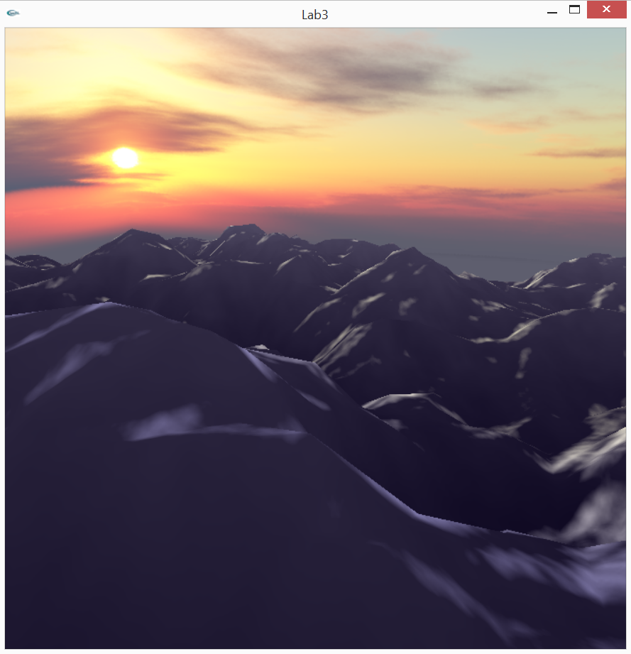
I'm technically not following the stanford curriculum anymore.. I just wanna make this one image as cool as I can so I wanna eventually add in water and fog in the background, after I get the normals working right for the mountains.
Trying to improve the lighting.. doing the normals was a bit tricky but this was ultimately very helpful. Now mountains look more realistic due to the lighting.
I'm technically not following the stanford curriculum anymore.. I just wanna make this one image as cool as I can so I wanna eventually add in water and fog in the background, after I get the normals working right for the mountains.
March 01, 2015
BOOM SON
My thing worked!

Perlin noise used here: I have an image of Perlin Noise and loaded that as a texture. Then in the vertex shader I did the texture map thing, got the x value, and set the height to that. So it's not terribly complicated but it look really cool, especially when it's rotated around. I really wish I had screen capture software but I'm paranoid to download things off the internet now after what happened last time.
Contemplating whether I wanna add water or just leave it as is.
February 28, 2015
Trying
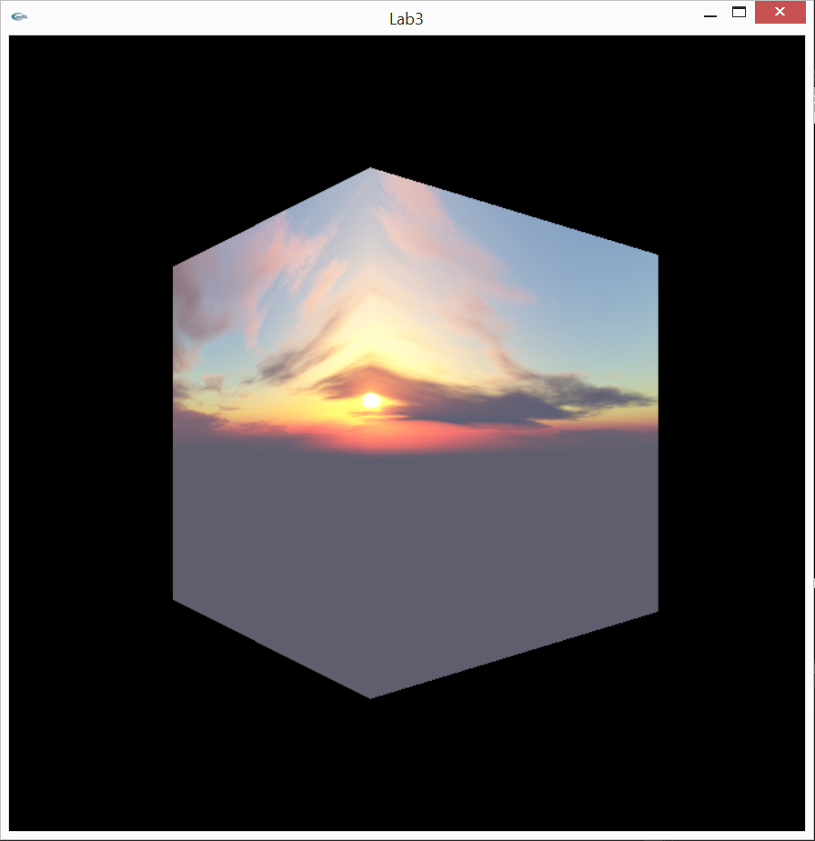
So I made two separate shader programs: one for the skybox and one for the rest of the scene. Took a while in doing so because I'm an idiot sometimes and made some dumb mistakes.
Things for Grace to remember next time:
- Before calling glUniform[...] you need to make sure the appropriate shader program is loaded first (uniforms won't get passed through otherwise)
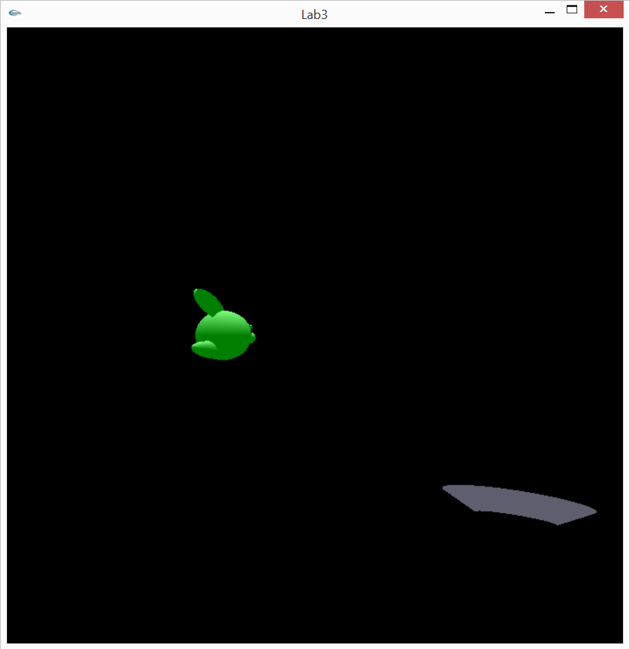
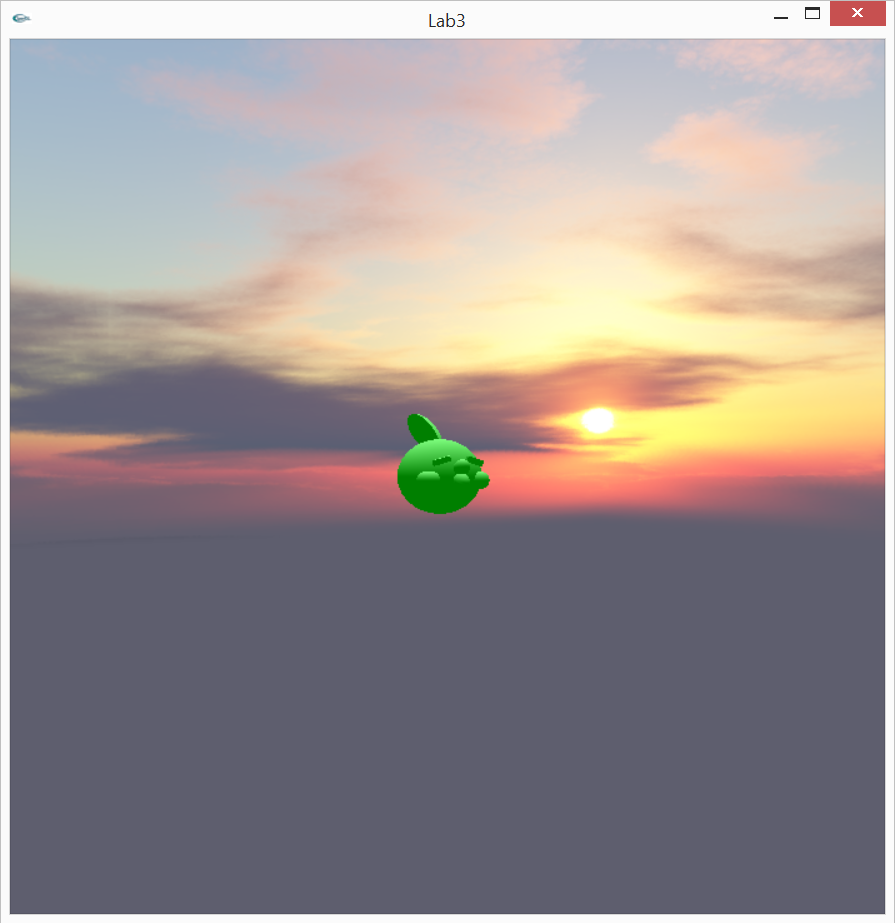
- If you don't bind the correct vao's right before drawing (if you have multiple shaders) then weird stuff happens where attributes of one shader affect the attributes of another. Left pic below, the weird shape in the bottom is supposed to be my skybox but it was affected by the Gulpin's geometry. Right pic is correct version. Hi Gulpin!
 - You need to match up the names you're giving variables in the shaders with the names you call in glGetUniformLocation or glGetAttribLocation! Errors will result if not!
Many more. These are the ones I remember off the top of my head.
Trying a crack at procedural geometry, I eventually want to use Perlin noise but right now I'm just using a random number generator in the vertex shader to affect the height of the ground

SUCH a hack right now but it's a start.
Things for Grace to remember next time:
- Before calling glUniform[...] you need to make sure the appropriate shader program is loaded first (uniforms won't get passed through otherwise)
- If you don't bind the correct vao's right before drawing (if you have multiple shaders) then weird stuff happens where attributes of one shader affect the attributes of another. Left pic below, the weird shape in the bottom is supposed to be my skybox but it was affected by the Gulpin's geometry. Right pic is correct version. Hi Gulpin!
Many more. These are the ones I remember off the top of my head.
Trying a crack at procedural geometry, I eventually want to use Perlin noise but right now I'm just using a random number generator in the vertex shader to affect the height of the ground
SUCH a hack right now but it's a start.
February 20, 2015

February 19, 2015
Updates
I haven't been neglecting my graphics study.. I just had a small issue where both of my laptops stopped working within 2 weeks of each other, and I'm dumb and didn't use Github for any of them so I've had to rewrite all of them from scratch, twice. Plus side is that it's gotten quicker and easier each time.
Anyways, I've been trying to recreate this scene in OpenGL:

It's kinda an inside joke between me and a few school friends so I thought it'd be fun to make a project out of it (Assignment 2 on Stanford's calendar). Modeled the Gulpins in Maya and loaded them into OpenGL through an obj loader script I found online. I was gonna model Charizard but first laptop broke and for sake of time I just modeled an angry face.
Then second laptop broke and instead of going back to this project, I'm gonna start a new one that I had considered before. I'll post updates once I get enough of it working to show off.
Discovered SOIL as a way to load images into OpenGL which makes it a lot easier than last time I tried, once I got SOIL working. I'm starting to understand linkers and include directories better in Visual Studio but I definitely did not understand it before. And for SOIL you have to open up the directory in a separate Visual Studio project, build it, then copy the project over to your current project in order for it to work, which took me a long time to figure out. Once you get through the initial frustration of hooking of SOIL though, it seems to be a lot simpler than what I used last time for image loading.
I really wish I still had the code for my Harry Potter wand.. it was cool, especially since I've really been in a Harry Potter mood lately.
Anyways, I've been trying to recreate this scene in OpenGL:
It's kinda an inside joke between me and a few school friends so I thought it'd be fun to make a project out of it (Assignment 2 on Stanford's calendar). Modeled the Gulpins in Maya and loaded them into OpenGL through an obj loader script I found online. I was gonna model Charizard but first laptop broke and for sake of time I just modeled an angry face.
Then second laptop broke and instead of going back to this project, I'm gonna start a new one that I had considered before. I'll post updates once I get enough of it working to show off.
Discovered SOIL as a way to load images into OpenGL which makes it a lot easier than last time I tried, once I got SOIL working. I'm starting to understand linkers and include directories better in Visual Studio but I definitely did not understand it before. And for SOIL you have to open up the directory in a separate Visual Studio project, build it, then copy the project over to your current project in order for it to work, which took me a long time to figure out. Once you get through the initial frustration of hooking of SOIL though, it seems to be a lot simpler than what I used last time for image loading.
I really wish I still had the code for my Harry Potter wand.. it was cool, especially since I've really been in a Harry Potter mood lately.
January 19, 2015
Harry Potter Wand!!
This semester for independent study I'm trying to stick to a more structured curriculum.. last semester was nice and I still learned a lot but only restricting myself to the fragment shader of the graphics pipeline meant I avoided a lot of the dirty work, which unfortunately is very necessary in the real world. When my friend, taking rendering last semester, came to me for help, I was surprised at how unhelpful I was about seemingly simple concepts. So this semester I'll be following Stanford's CS 148 curriculum closely instead.
So I've pretty much finished their Lab 1, which was doing some 2D graphics with OpenGL. I've recently been on a Harry Potter kick lately so I decided to implement a wand that lets you cast four spells (lumos, aguamenti, baubillious, bombarda) with user input into the console window.
I still haven't managed to get a good gif software so I'm just posting screenshots for now, even though the animated spells in my program look better, I swear!


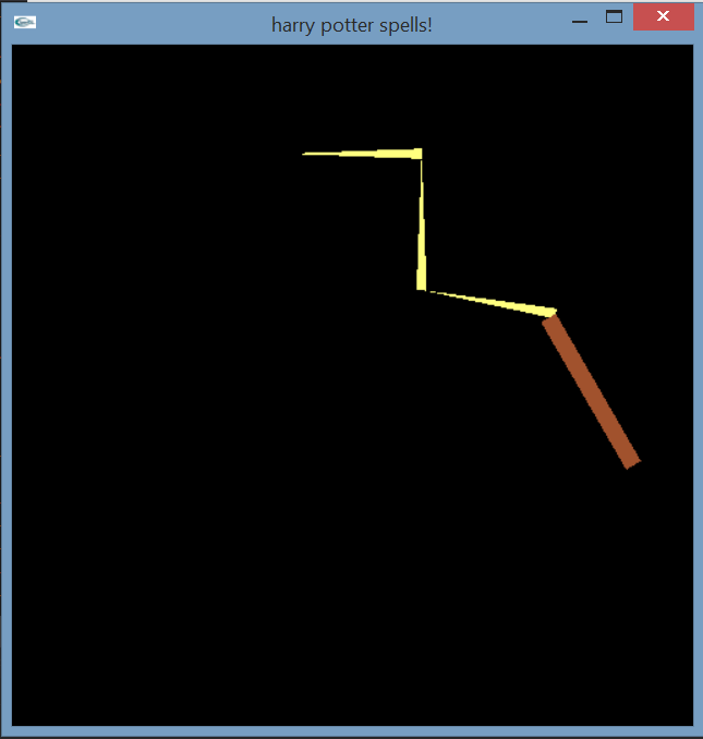


Aguamenti shoots out water (I figured a bunch of blue specks would be somewhat accurate). Baubillious makes a lightning bolt, bombarda produces small explosions, and we all know that lumos provides light. The animated lumos spell looks better, here it just looks dumb but the circles pulsate and it's actually pretty relaxing to watch.
Hey Stanford, did I get an A on this?
So I've pretty much finished their Lab 1, which was doing some 2D graphics with OpenGL. I've recently been on a Harry Potter kick lately so I decided to implement a wand that lets you cast four spells (lumos, aguamenti, baubillious, bombarda) with user input into the console window.
I still haven't managed to get a good gif software so I'm just posting screenshots for now, even though the animated spells in my program look better, I swear!
Aguamenti shoots out water (I figured a bunch of blue specks would be somewhat accurate). Baubillious makes a lightning bolt, bombarda produces small explosions, and we all know that lumos provides light. The animated lumos spell looks better, here it just looks dumb but the circles pulsate and it's actually pretty relaxing to watch.
Hey Stanford, did I get an A on this?
Subscribe to:
Comments (Atom)